Mazda Logo: The Fascinating Journey Of Evolution

As most of you must know by now, Mazda is an extremely successful multinational automaker that hailed from Japan. Fascinatingly, a company that used to be the cork manufacturer rose through the ranks as one of the most legendary brands of cars that made billions in revenue and most importantly, became the global influencer that it is today.
Lots and lots of innovative and world-changing inventions came from Japan, and Mazda is one of those that have been making wonders in the field of automobiles.
Compared to the year 2020, this Japanese motor corporation declined in sales in 2021, which is mostly due to the intensity of the Covid-19 pandemic, nevertheless they managed to bring in approximately 2.14 trillion yen or around 18.57 billion USD in revenue.
The Mazda logo that we all know, and love wouldn’t exist if it weren’t for the catchy name Mazda. Do you know how Mazda came to be called the way it is?
Mazda Logo: What Does Mazda Mean?
The Mazda Motor corporation got its name from the god of harmony, intelligence, and wisdom, “Ahura Mazda”. Now, you most likely haven’t heard of this god before, unless you’re an enthusiast in Asian History, since Ahura Mazda was the creator deity in Zoroastrianism most reserved for Iranian people.
As with a lot of car brands, Mazda has been changing its appearance ever since it came into its own in 1931. The cork manufacturer, then called “Toyo Kogyo Co., Ltd.” launched its first-ever vehicle, the Mazda Go, after the 2nd founder took over the company.
Interestingly, the name of the founder of Mazda was “Jujiro Matsuda”, a very common name in Japan, so the company name was in part a tribute to the late founder.
Due to the impact of the First World War, the company got shut down, but then Jujiro Matsuda arrived to revive the whole company from scratch, which was why he was such a pivotal figure in the history of Mazda.
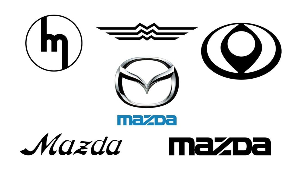
>> Check out: What Is The Meaning Behind Nissan Logo?
Mazda Logo: The Journey Of Evolution
Enough about the meaning of the names, we are here to discuss the evolution (I believe there are more to come) that is the Mazda logo. As with many car brands, the Mazda logo’s history is as adventurous as their products’ development.
From 1920 to 1931
It seems very obvious that this logo came during the period when Mazda was still a cork manufacturer, as it had two stylized cleavers that were used to cut metal and other mechanical parts.
From 1931 to 1934
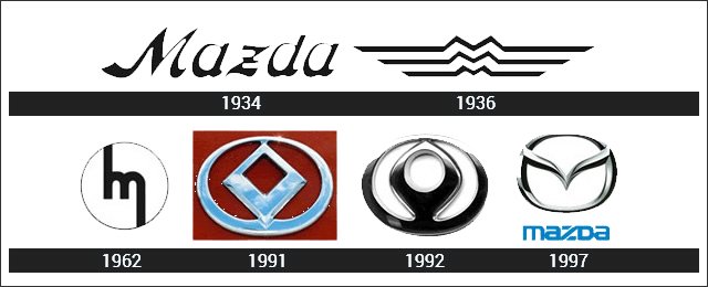
The logo from 1931 changed drastically, featuring a handwritten regular cased “Mazda” which had a blue frame. At the back, there were three diamond shapes positioned into a star. The logo was abandoned in 1934.

From 1934 to 1936
Compared to the last one, Mazda made the logo less fancy, opting for smoother handwriting for the “Mazda” which was in my opinion, much more elegant and minimal befitting the Japanese culture and people. They also dropped the diamond shapes at the back.
From 1936 to 1959
Now this one for some reason reminded me of Wonder Woman’s belt logo. However, instead of being idealized Ws for Wonder Woman, the Mazda logo spotted three Ms which stood for Mazda Motor Manufacturer.
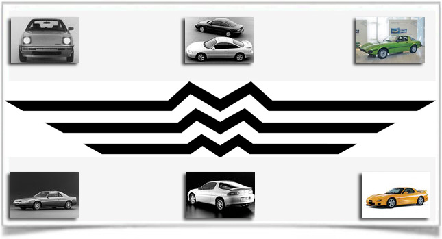
While the Wonder Woman logo was more like a shiny eagle symbolizing her high and mighty superhuman capabilities, the wings on either side of the Mazda logo symbolized the speed and flexibility of their high-quality products
From 1959 to 1975
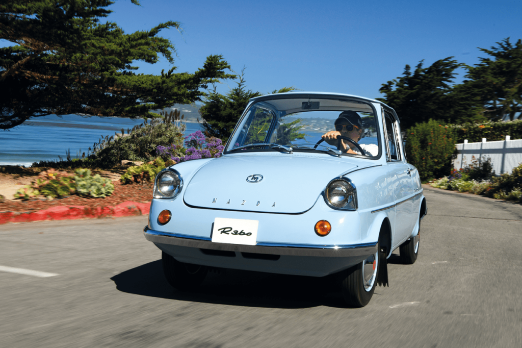
The year 1959 marked one of the most significant achievements in Mazda’s history. Their first ever Kei coupe (minicar), the R360, set a milestone not just for Mazda’s future generations of cars, but also the Kei car segment in Japan in the 1960s and its influence went on to live in today’s Kei cars.
>> See more: Kei Cars – Everything You Need To Know
This minicar was also the manifestation of Mazda’s reputation as a small but unique brand of cars. To commemorate this achievement, Mazda changed its logo. The “Mazda” is now fully uppercase and italicized but took the backstage.
The red “M” at the top was stretched at its side, the first stroke was stretched upwards and the last stroke downwards, the whole thing was enclosed in a thin red circle.

1975 to 1991
After the 1959-1975 period, the company’s then-director decided to revert to the minimalistic design with their logo. As you can see, this style of handwriting for the “Mazda” was consistently used in their future logos. The “Mazda” was more like “mazDa” with all the characters the same height and the z got cut into three pieces.
The characters are more digital style, shorter than before, and looked like they fit perfectly into a rectangle. This logo stood for the company’s qualities: reliability, power, and of course, creativity.
1991 to 1992
This logo is rather short-lived but has most of the elements of today’s logo. The “Mazda” is now topped by an oval with a diamond shape inside of it. This new logo represents the rugged diamond that shines with all its might, or it can also be interpreted as a blue flame with the sun in the background.
Mazda was a game-changer in their every product, and the logo shows just that: a company with a burning passion for innovation and works hard towards the ultimate goal that is making the best cars to please their customers.
1992 to 1997
The new Mazda logo introduced in 1992 was inspired by its predecessor. There wasn’t any stark difference between the two, aside from the flame now being a little more flamboyant and smoother.
The designers decided to change the old logo in that way due to the Renault logo being quite similar (after all they both have that diamond shape).
Jun 1997 to Sep 2015
The current Mazda symbol was introduced in 1997. The symbol was described by Mazda as their determination to “pursue ongoing improvements to drive powerful, continuous growth”, hence the pair of wings shaped like a letter M inside an oval.
The V-shaped wings are also suggestive of Mazda’s flexibility, creativity, forward mentality, and kindness. The Mazda logo’s meaning has evolved.
2015 to 2018
The name on the logo is now changed to accompany the theme on the symbol, with only a touch of blue left. This period marked the company’s success in putting the car designs and key technologies in sync on the production line.

Oct 2018 onwards
The only thing that was removed was the blue border on the Mazda name. Overall, the theme remained gray.
There is a story behind every name, and Mazda’s story was effectively conveyed through the long history of evolution that is the Mazda logo. There are still a lot of brand logos out there that have a compelling story behind them, so be sure to check them out as well.


